Guide for the use of the NHS Blocks plugin.
What does NHS Blocks add to your site?
A series of display components from the NHSUK Frontend Library, based on research from the NHS Service Manual to ensure that NHS websites are consistent, fully accessible and easy to use whilst also looking great. This website uses these elements (in fact you are looking at the panel element right now), and examples of the elements are in the video immediately below.
Each section on this page describes a single element along with how you can create and edit it. There is a video guide for each element, and text guides. The text guides are broken down to two sections :
- Quick Start – this is suitable for people who are confident editing WordPress sites and would just like a quick once over of how the element works
- The long read – this is a more detailed, step by step guide for those just getting started with WordPress or adding content to websites
This plugin is a companion to the Nightingale WordPress theme – the plugin will work with any theme, but for the full NHS look and feel, we strongly advise you to also run the theme.
Find the plugin on WordPress.orgNon-urgent advice: Install the plugin
If this plugin is not installed, the blocks described in this guide will not be available. Please note you will also need the Gutenberg plugin from the WordPress plugin library for all of the blocks to function correctly.
To install the plugin, navigate to your Admin section and log in. In the left hand panel, click “Plugins”, then click “Add New”. In the search box type “NHS Blocks” and press your enter key. You will see the plugin, hover over it and click the “Install button” which will come up. Once installed a message will pop on your screen. Then hover over the plugin again and click “Activate”. Thats it!
If you do not already have the Gutenberg plugin, you will need to add that in the same way – search “Gutenberg” in the plugins screen and install then activate it. The NHSBlocks plugin will not have full functionality without the Gutenberg plugin also installed.
This website uses both the theme and plugin described in this article.
Once installed, all of the new blocks described below will be available when you edit any page or post in WordPress. Click the plus icon to add a new block, and in the list of available blocks you will see a new category – NHS Frontend Blocks. All of these blocks described below are in that category. For guidance on the standard WordPress blocks and how to use them, please see the official WordPress guide to Gutenberg
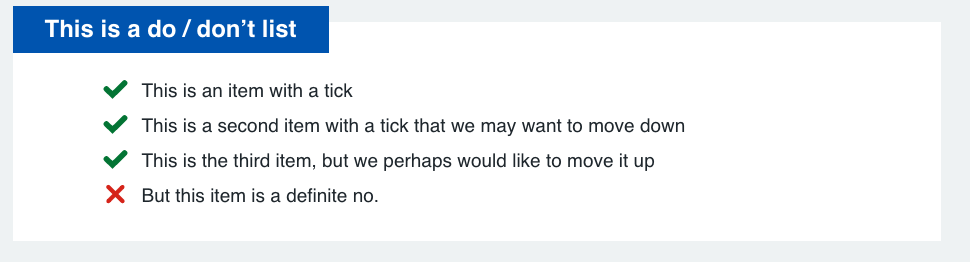
Do and Don’t List
Use Do and Don’t lists to help users understand more easily what they should and shouldn’t do.
This block is designed to be used on pages where you wish to display a list of items with simple indicators to show positive or negative outcomes or intentions.
Quick start:
The long read:
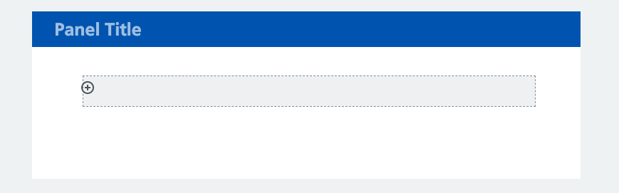
To get started with the block, choose it from the NHS Frontend Blocks section when adding a block. You will see a very basic block showing with a Panel title and an inner block zone:
Click into the title area and give your block a title by simply typing.
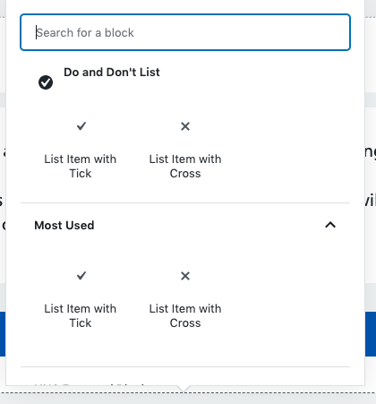 Then click the plus icon in the grey area inside your block. This will give you a popup where you can choose to add either a “List item with Tick” or “List Item with Cross” – these then add the relevant item to your block. You can now type next to the tick or cross to indicate the action, activity or status of an item. You can add as many of these items as you like to a block, once you have finished typing to add another click the plus icon in grey below where you typed.
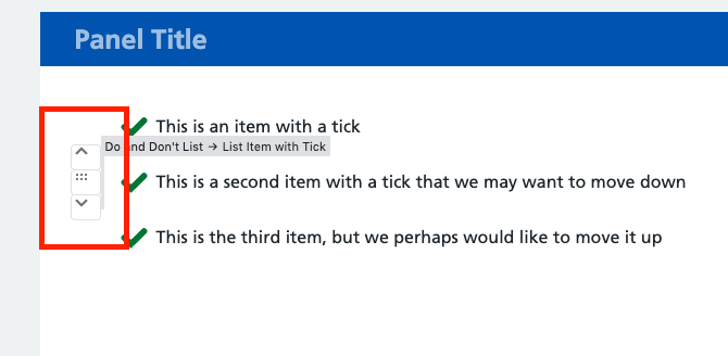
You can also re-order your items and delete them on future edits should you so wish. To reorder, hover over the list item and you will see arrows in grey next to the left hand border of the item. Clicking these will have an immediate action to either move the item up or down.
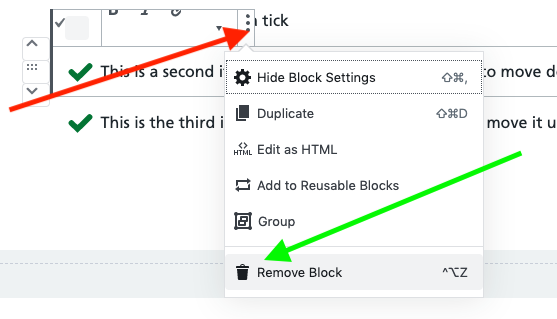
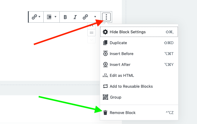
To remove an item, click it. You can then click the three dots icon [red arrow] to see more actions. Select “Remove Block” [green arrow] and the item goes immediately from the display.
When you have finished editing, your list should look similar to the below image:
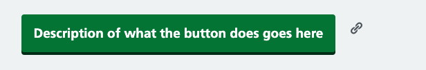
Buttons
Use buttons to help users carry out an action on a page like starting an application or saving their progress.
This block is designed to be used to show items that a click in this area will lead to an action occurring. The label on the button should make it clear what this action will be – do not simply label the button “Click here”.
Quick start:
The long read:
To get started with the block, choose it from the NHS Frontend Blocks section when adding a block. You will see a preview of the button immediately, and can type into the button to give it a label straight away:
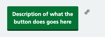
If you wish the button to wrap onto a second row, use your Enter key when typing:
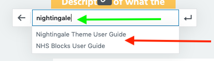
You will notice the chain icon to the right of the button in the editor. Clicking this lets you add a link to the button. This will open an editable text area. You can either paste in a full link (if you wish to link to somewhere outside of your website), or if you wish to link to a page on your own website, simply start typing the title of the page [green arrow] and a list will come up with search results. When you see the page you are looking for, click it [red arrow]. Now press the Enter key on your keyboard, and the system will save your link.
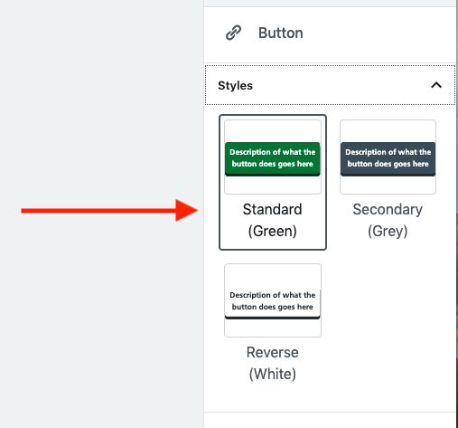
And finally, you have the option to change the colour of your button. On the right hand panel of the editor you will a section titled “Styles”. Click this title, and the sub-panel will open. You will see three options, clicking any of them immediately changes your button.
Simple Reveal
Make a complex topic easier to digest by letting users reveal more detailed information only if they need it.
This block is designed to be used to reveal additional information. It is particularly useful when you have extensive content or when your visitors are likely to dip in and out to a web page to get specific bits of information. Expanders can be used to make accessing detailed information much quicker. Bear in mind that the importance of the titles on each expander, as this greatly affects the effectiveness of this as a tool. It can also be used for Frequently Asked Questions.
Quick start:
The long read:
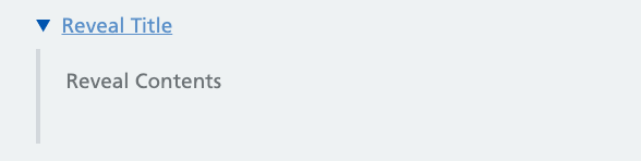
To get started with the block, choose it from the NHS Frontend Blocks section when adding a block. You will see a very basic block showing with a title next to a downward pointing arrow and a body section with “Reveal Contents”. Clicking in either area lets you immediately edit the text by typing:
You can add as much text to the contents as you like – clicking the Enter key on your keyboard will add a new paragraph.
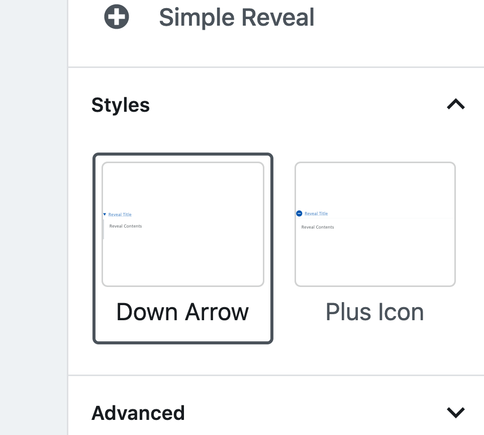
The Simple Reveal element has two styles available, and to change the style, use the right hand panel of the editor. You will see a visual guide as to how the style will affect your content, and clicking the style of your choice will immediately change it.
These can be particularly effective display tools for a website when used in combination (as on this page using the “plus icon” style)
Panels
Panels can be used to differentiate content and to group similar content together visually
This block is designed to be used on pages where you wish to display content in an easily recognisable way as grouped together, or to highlight content.
Quick start:
- Choose the “Panel Region” block from NHS Frontend Blocks group in your block addition tool
- Click the title region to edit, and type the title you would like
- Click the contents region and start typing to edit. You can add extra paragraphs if you need by using your enter key.
- Edit the button in the same was as the button block (above)
- You can remove the button if you wish to just have a panel with text
- You can change the appearance of your panel using the “Styles” header in the right hand area of the edit screen. Clicking a style changes it in the editor immediately
The long read:
To get started with the block, choose it from the NHS Frontend Blocks section when adding a block. You will first be given a choice of a pre-defined template:
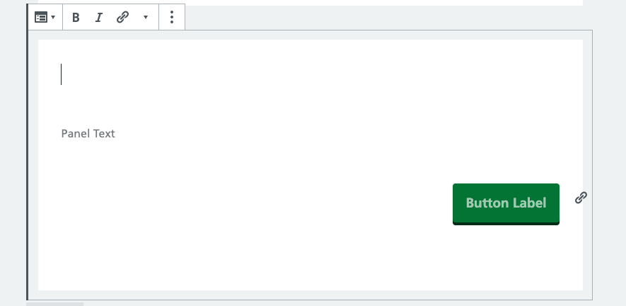
Where the cursor initially starts is the panel title. Type in any title you would like here. Clicking the “Panel Text” region lets you add your content easily in the same manner.
The button can be edited as a standard button (see Buttons section above), or can be removed from the panel altogether by clicking into it, clicking the three dots [red arrow] and clicking “Remove Block” [green arrow]
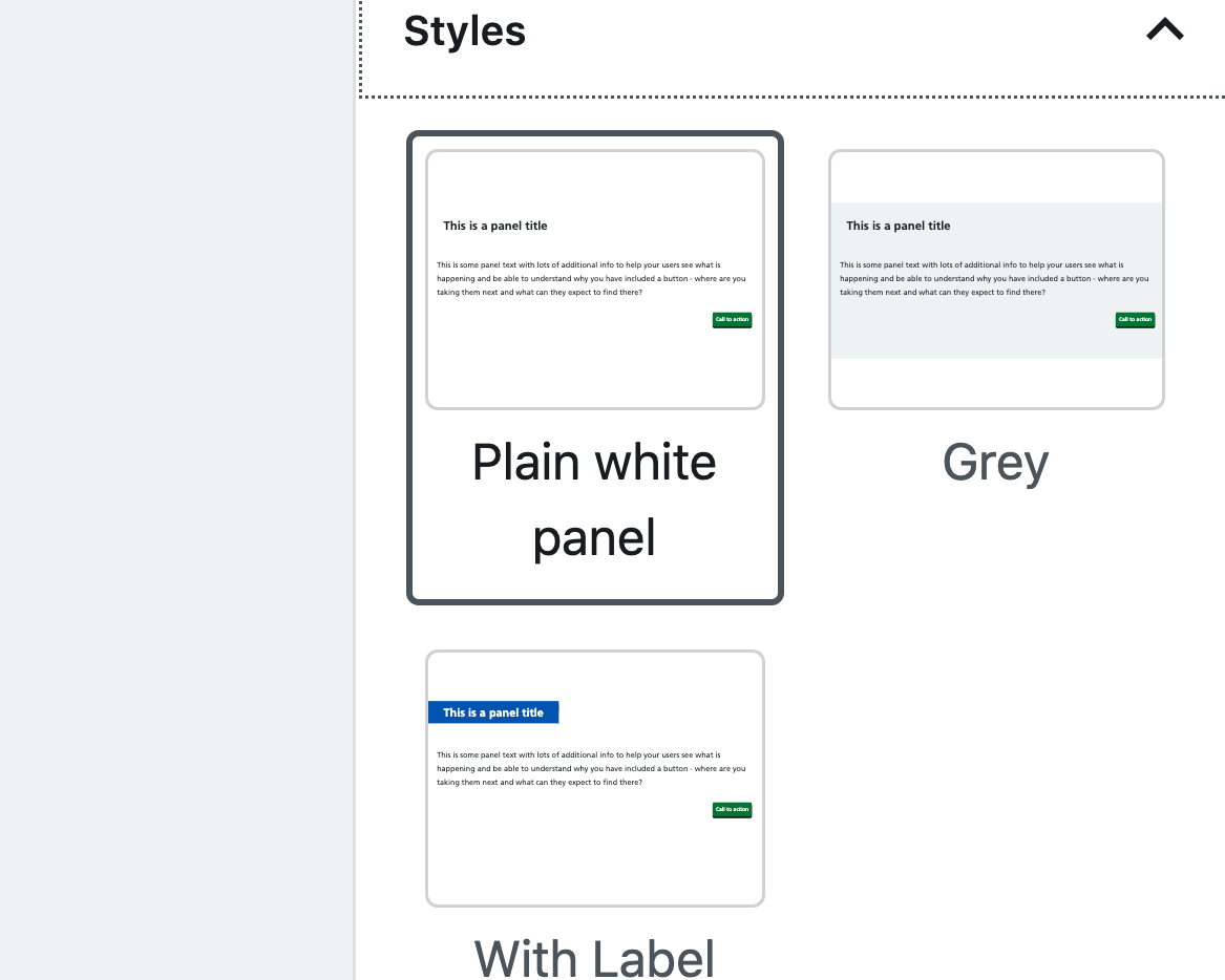
As with other blocks, there are multiple styles available for your panels. And as with other blocks, these can be accessed using the right hand zone in the editor, and clicking on the “Styles” heading. A visual preview of the style will show, and clicking on your preferred style will take immediate effect so you can preview how things look.
Promo
The promo block is designed to act as an onscreen “advert” for content. It sits in a fully clickable region and is differentiated from other content on the page.
This block is designed to be used on pages where you wish to highlight additional content with the whole block being clickable.
Quick start:
- Choose the Promo block from your add a block dialogue in the NHS Frontend Blocks section.
- Add a link by clicking the chain icon. All promo blocks should have a link.
- Optionally add an image to your block by clicking the plus icon in the grey area and then choosing Image.
- Edit the title and contents by clicking them and typing
The long read:
To get started with the block, choose it from the NHS Frontend Blocks section when adding a block. You will first be shown the pre-defined template:
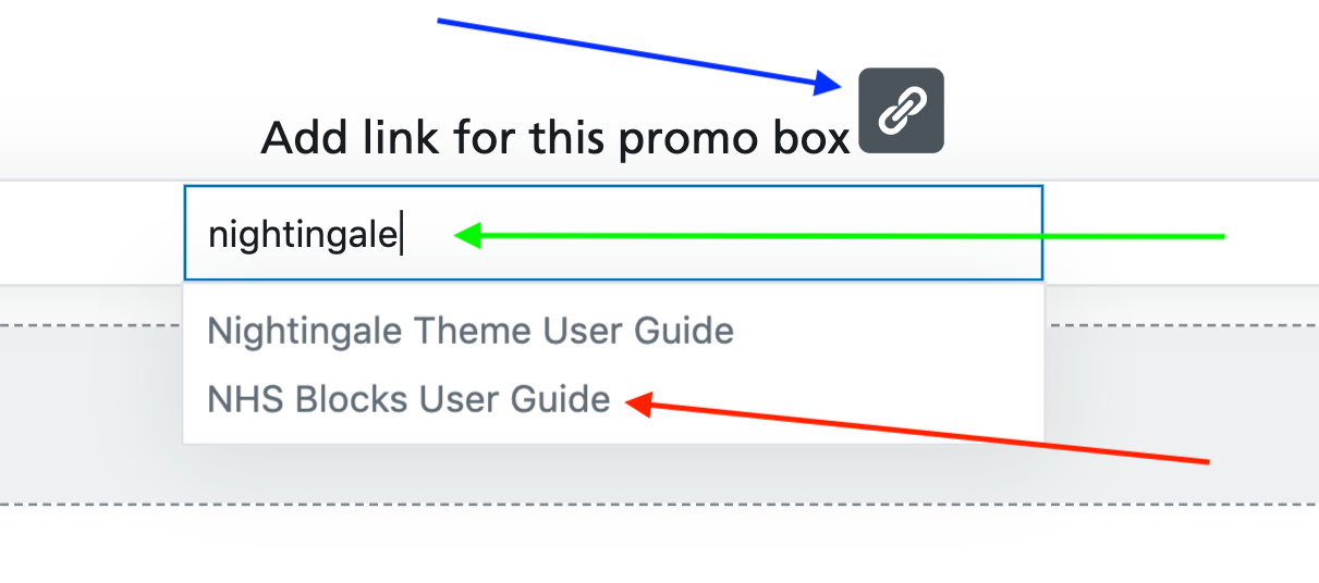
As with previous blocks, the chain icon indicates a link. You should click this to select a link [blue arrow]. Please note the whole block will be clickable. You can either paste in a full link (if you wish to link to somewhere outside of your website), or if you wish to link to a page on your own website, simply start typing the title of the page [green arrow] and a list will come up with search results. When you see the page you are looking for, click it [red arrow]. Now press the Enter key on your keyboard, and the system will save your link.
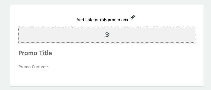
Next, you can optionally add an image. To do so, simply click the plus icon in the grey rectangle below the chain icon to add an inner block, and choose “Image” (this is the only option). You can then Upload a new image or add a new one to your media library using the WordPress native image management tools.
To edit the Promo Title and Promo Contents, click either and start typing. Your edits will show immediately in the editor area.
Simple Quote
The simple quote section takes content out of the normal stream and adds a left hand border to help users identify and understand important content on the page, even if they don’t read the whole page.
This block is designed to be used on pages where you wish to highlight content in an easily recognisable way – principally for user feedback, testimonials or quotes, but it can also be used to highlight important information, legal specifications or other data which you wish to differentiate from the rest of the page.
Quick start:
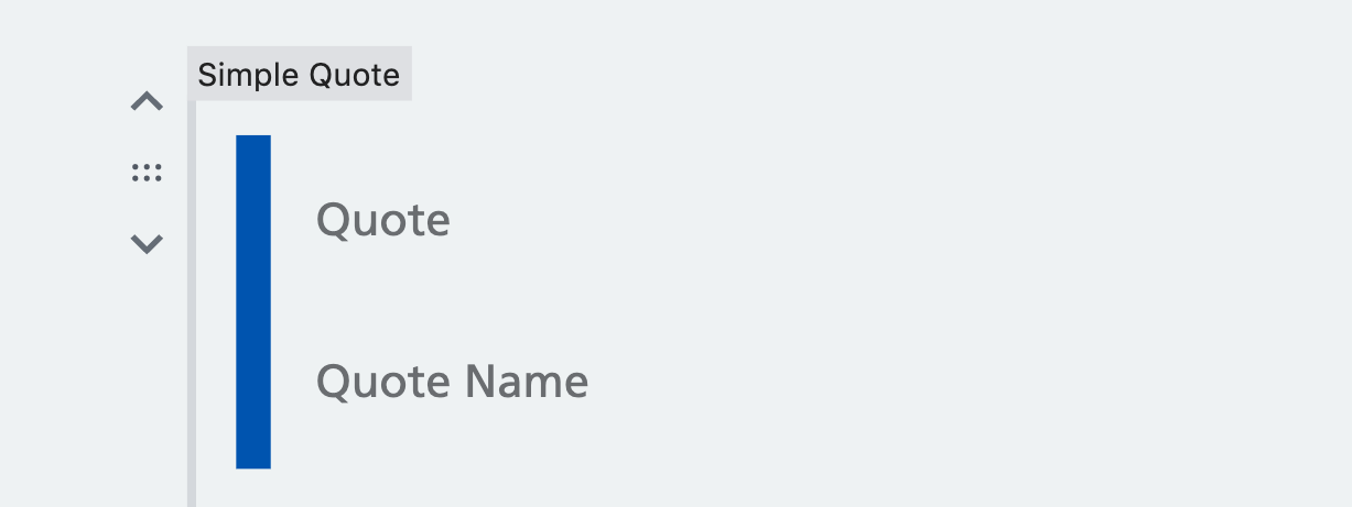
- Select “Simple Quote” from the NHS Frontend Library” section of the block editor
- You have two fields available. “Quote” is where the main body should go.
- “Quote Name” is used for attribution as a single line of text at the bottom of the block.
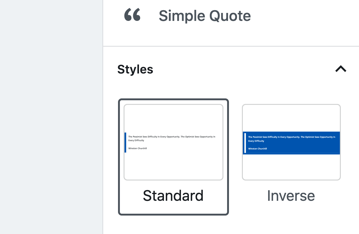
- In the styles panel (right hand region of the edit screen) you can change the block to inverted.
The long read:
To get started with the block, choose it from the NHS Frontend Blocks section when adding a block. You will first be see two simple text fields:
Clicking either allows you to type your content straight in. The “Quote” region is where the main body will be. Please bear in mind that although this block is created for quotes and testimonials, you may be using it for other purposes. In all cases, the first region is where the main content should sit. The “Quote Name” region is a simple one line field. Again, this is designed for the name of the person providing the quote, but could be used for attribution of any sort.
To the right of the edit zone, in the editor panel, you will see there is a “Styles” heading. In this you have the option to invert the quote – instead of a blue left hand border and standard text, the block takes on a blue background. The border and text both switch to white. To select the Inverted style, simply click it and the editor will update immediately to show a preview.
Card Region
Use the card region to help users identify and understand the sort of care, information or action they need, who to contact and how quickly.
This block is designed to be used on pages where you wish to move content out of the normal stream and highlight actions or steps the user may need to be aware of. An alternative to panels, the card region draws the users attention and can also be used as a synopsis or “quick read” at the top of a text heavy page.
Quick start:
The long read:
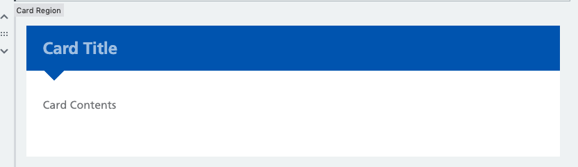
To get started with the block, choose it from the NHS Frontend Blocks section when adding a block. You will first be given a simple two field preview. Clicking either “Card Title” or “Card Contents” allows you to start typing straight away to add your content:
The other option with this block is to amend the style. To the right of your edit window you will see the editor panel. In here you will see “Styles” as a header. Click this to expand it. You then have three options. Clicking any of them changes the card in your editor window instantly:
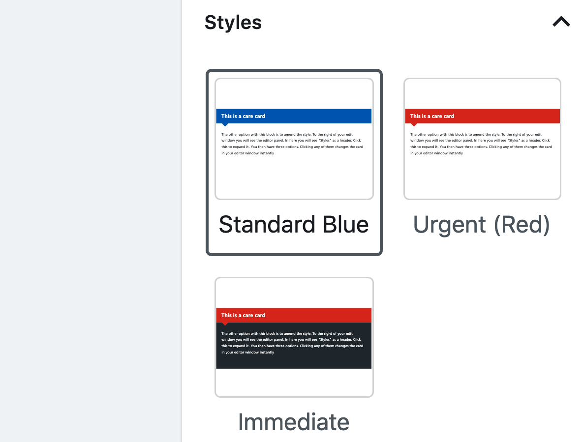
Please note. Normal content should always be in the standard style. Urgent should be used to draw attention to high priority content (using it too often diminishes this effect). The Immediate style should be used very sparingly, and has been shown to stand out in content sufficiently to get immediate attention of your users. If you use this too frequently, users will be drawn away from your other content.
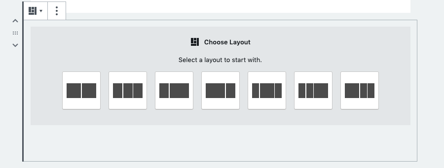
Grouped Items
The Grouped Items element is used to bring groups of content, information or data into a visually attractive layout
This block is designed to give more visual freedom to page editors and to allow for some better aesthetics to a web page.
Quick start:
- Select “Grouped Items” from the NHS Frontend Library” section of the block editor
- Choose a pre-configured layout
- Select a block type in each region
- Edit each block as if it was a standalone element (i.e. if you chose “Promo” block, use the “Promo” instructions from above).
- We recommend you choose the same type of block and use the same styles for each row of content
The long read:
To get started with the block, choose it from the NHS Frontend Blocks section when adding a block. You will first be given a choice of a pre-defined template:
Once you have selected your template, you then have the option to choose a type of block in each region:
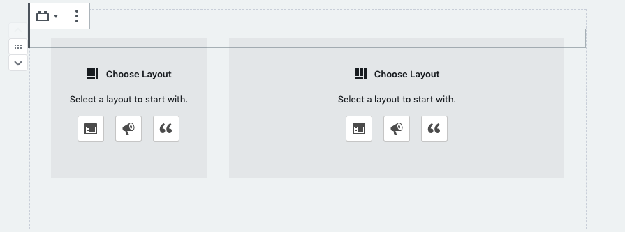
Your choices are Panels, Promos or Quotes. Clicking the button opens up the editor in that style of block. (please see notes above for how to use these three block types). We strongly recommend that blocks in the same row are of the same type. It also makes sense to keep them in the same styles (i.e. if you use Panel with label then use that style on the other blocks in the same row)
.