Redesigning our Virtual Campus Offer
Non-urgent advice: Virtual Campus Update
We’re pleased to announce that over the next few weeks, we’re rolling an updated look and feel out to our Virtual Campuses (VCs). Appreciating the amount of change we’ve all seen over the last few months across the NHS and the stress this can bring, we’d like to update all of our staff and participants on what’s changing and why, and hopefully share the excitement around new possibilities and features that this may enable us to use as we look forward to our new normal.
Firstly, to reassure you that we won’t see major changes to functionality or features initially; the VCs will still let you login, access programme resources, and use messaging and forums just as before. What will change is the look and some of the layout, and the background below gives you some more context and screenshots in advance of the update.
Secondly, to reassure you that as you resume your programme journey, the Digital Team will be here to help with any questions or issues you may have so reach out and contact us if you need to.
All of our Virtual Campuses will be upgraded and tested over the next few months so by the time our suspended programmes resume, you are likely to see the new-look when you log in again.
You may also find our support guide on the visual changes useful.
Non-urgent advice: Why are we doing this now?
For our Leadership Development Programmes, we use an online learning platform called Moodle. Moodle is open source software, widely adopted across the academic world and has a strong open source community behind it, so it feeds into our digital ethos of open source first. This year, Moodle 3.9 has been released which offers us extra security control, improved functionality and ensures we are able to offer the latest in technology to our participants. However, our previous theme will not work on this version. So we needed to investigate and apply a new design.
Moodle 3.9 is also a long-term support version, meaning that once we’ve updated to it, we can provide a longer period of stability until well into 2023. Details regarding Moodle versions are available on their releases page.
In our other work streams, we have adopted the NHSUK Service Manual design – not only is this a heavily researched, evidence based design, it also offers an immediately recognisable NHS interface. The site you are looking at right now is an example of our WordPress theme which we previously wrote about. From our prior experience with Moodle, we know that it has some very customised user interfaces, and that the components within the NHSUK Service Manual design would not cover all of the design patterns an extensive, interactive and immersive online learning platform requires.
We decided to proceed with a hybrid model, taking the best of Moodle, with their experience of global sites offering online learning platforms, and the best of the NHSUK design patterns, with the accessible, responsive and recognisable branding of the NHS integrated. Using our previous work on the old theme as a pattern, and comparing it to the default theme shipped with Moodle (Boost), we were able to rapidly prototype a site and change the header to be more in keeping with the branding without losing the native feel of Moodle:
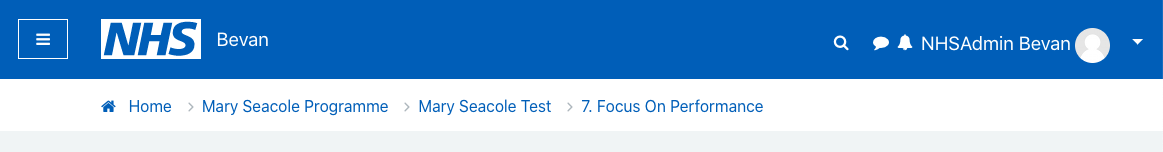
Whilst not exact replica of the NHS service manual header, this gives users instant access to the site navigation (menu icon toggle on left hand side), search, messaging and notifications (icons on the right hand side) as well as direct access to their user profile and controls. We also needed to style the whole user journey, from login, to course selection, module choice, interactive learning, marking completion, social interactions and course completion.
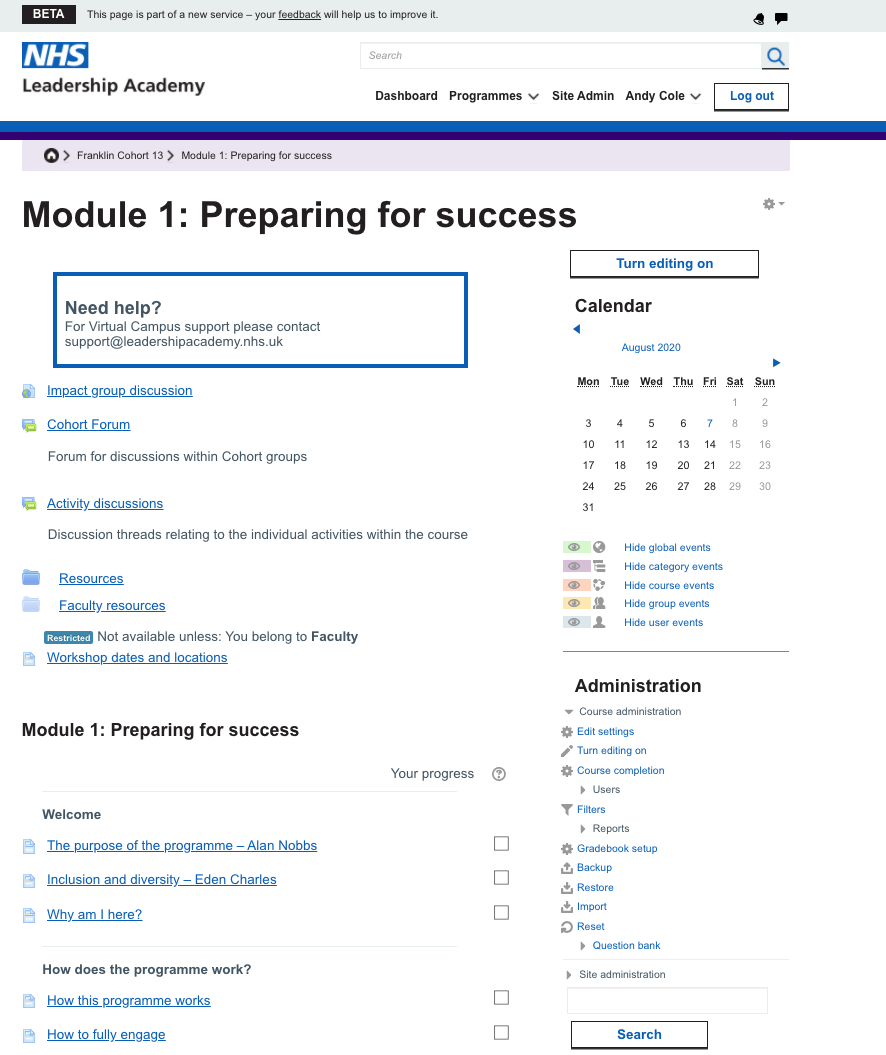
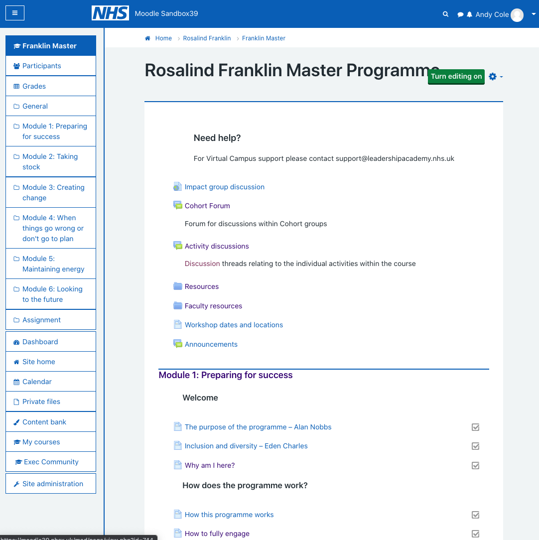
The design is quite a change to users who will have previously visited our sites, so it is vital that we communicate what has changed and how to our participants in a friendly way. As an example, this is a side by side comparison of the interface on a module screen on the old and new designs:
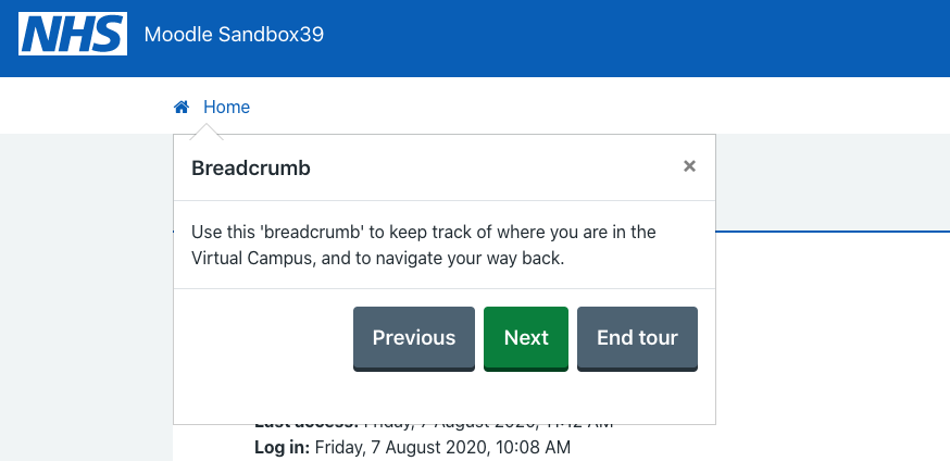
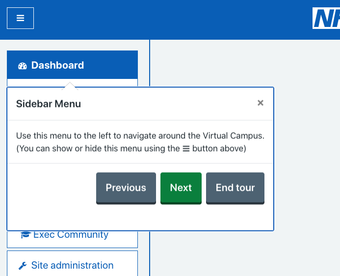
One of our major concerns was that users would not have easy access to their controls, or be unfamiliar with how to navigate the new layout. Luckily, Moodle has a new feature called User Tours, which can be defined to be context specific and take the user around a page showing them where controls are, how to access things and can explain the rationale behind design choices. We were able to leverage these to create user tours for all of the changes. And whilst these automatically fire the first time a user visits a type of page, users are also able to reset the tour to view again at any time. You can see them in action below:
Non-urgent advice: Summary
By combining the user tours with the standard communications involved in any upgrade to our site, we have a high level of confidence that this new design will give measurable improvements to our user’s online learning experience. We plan to roll this upgrade out over the coming weeks so that as users return to our programmes they will be able to take advantage of the latest functionality, an improved design experience and a safer learning platform.